
List Building
Comparing signup forms by context and intent
Compare embedded, dedicated, pop-up, event and checkout signup choices by the visitor's task, permission clarity and resulting record.
Choose a signup form by what the visitor is doing when they see it. Reading an article, registering for an event and completing a purchase are different immediate tasks. The optional email choice should be clear without getting in the way of that task.
Match the form to the moment
| Context | Form approach | Main question |
|---|---|---|
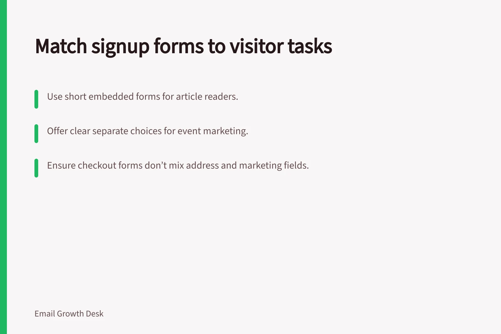
| Related article or resource | Short embedded form beside or after the content | Does the invitation name the updates clearly? |
| Dedicated newsletter invitation | Shareable signup page with room to explain the emails | Is the signup action easy to find? |
| Site-wide prompt | Pop-up with a specific offer and an easy way to dismiss it | Does it interrupt visitors before they have enough context? |
| Event registration | Separate optional choice for later marketing | Could registration be mistaken for a subscription? |
| Checkout or account creation | Distinct marketing choice near the address field | Could an address needed for a receipt be added to marketing? |
This is a design comparison, not a ranking by conversion rate. An embedded form and a dedicated page can support the same newsletter; choose according to the visitor's task and how much explanation the invitation needs.
Keep the marketing choice distinct
Keep the marketing choice separate from the immediate task. Completing an order or event registration should not silently enrol someone in later marketing.
For a workshop event, one action could say “Register for the class”. A separate optional choice could say “Email me future class dates and equipment-care tips”. The first completes registration; the second describes continuing marketing. The exact permission decision still depends on the full form and circumstances.
Compare the whole journey
Review the invitation, fields, optional choice, submit action, confirmation and stored result. Check what happens when a person leaves a marketing box unticked, enters an invalid address or submits twice. The resulting record should reflect the choice shown on the form.
Ask only for information needed at that stage. Label fields and checkboxes so their purpose is clear, including to people using assistive technology. An email address may be enough for a general newsletter; a topic choice is useful if it changes what the person will receive.
For each form, note the visitor's task, the email promise, the permission action and the record created. If several forms feed one list, review each route.
Mailchimp documents how its Form Builder works and how to embed a signup form. Verify the relevant settings and resulting contact status in the system you use.
![What You’ll Get When You Subscribe: Receive monthly equipment-care advice from [Sender]; Emails sent roughly once a month, no more than weekly; Confirmed subscription requires inbox verification. Explaining what subscribers will receive at signup](/covers/explaining-what-subscribers-will-receive-at-signup-640.webp?v=bf124388)
![Check if subscribers still want emails: Under the Spam Act 2003 (Cth), consent and a working unsubscribe link are mandatory.; Use Mailchimp’s inactive segment only as a starting point—verify permission and signup context.; If no response by [date], pause the newsletter, not unsubscribe, per policy. Asking subscribers whether they still want emails](/covers/asking-subscribers-whether-they-still-want-emails-640.webp?v=5d185c05)
