Email Copy
Building a mobile email layout with a clear reading order
Build a mobile email layout that reads clearly in one column, preserves source order and keeps actions beside their explanation.
A mobile email layout works when the content reads sensibly in one column before any styling. Build the message in that order, then use responsive styling to adapt its presentation. This helps the email make sense on a phone and when read aloud by assistive technology.
Start with a single-column outline
Put the heading, essential detail, primary action and qualifying information in that order. If the email contains two offers, decide which one is primary and give each one its own complete explanation. A desktop layout can display them side by side, but the underlying order still needs to make sense when they stack.
Copy the visible text into a blank document without formatting. Can a reader identify what each button does and which conditions belong to which offer? If not, the layout is carrying information the words should carry.
Consider a hypothetical appointment email. If the left column says “New time: 10 am” and the right column says “Confirm by Friday”, a narrow view might stack the confirmation before the date it refers to. Group the new time and its explanation, then place the confirmation action after them. The example is a layout exercise, not a claim about a particular email client.
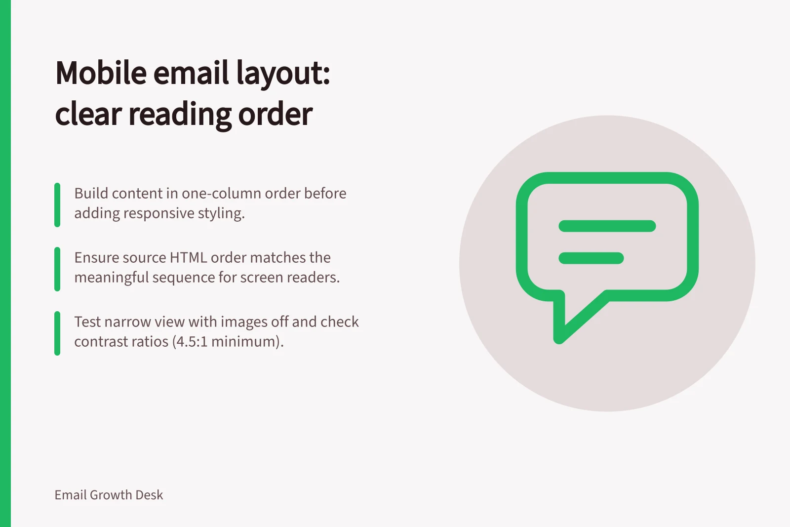
Build from the one-column sequence first: heading, essential detail, primary action, then qualifying information. Keep that order in the HTML before adding a desktop presentation. When the content stacks on a narrow screen, it should follow the same meaningful sequence.
Treat source order as part of the design
W3C Web Content Accessibility Guidelines (WCAG) 2.1 Success Criterion 1.3.2, Meaningful Sequence (Level A), says that when order changes meaning, a correct reading sequence must be programmatically determinable. In email, inspect HTML source order alongside the rendered view. Visual positioning, tables and responsive rules may produce a good-looking result while leaving the spoken order awkward.
Keep related elements together in the source. A heading should precede the paragraph it introduces; a button should follow the reason to use it. Avoid duplicating text or actions merely to make mobile and desktop layouts appear different, because duplicates may both be announced by assistive technology. If your email tool generates HTML, inspect its output rather than assuming the editor's canvas reflects the reading order.
HTML text is a meaningful sequence, and tables and ordered lists are meaningful sequences too; unordered lists are not. For a multi-column layout, check that reading down one column and then the next still preserves the meaning. CSS positioning can change the visual arrangement without changing the programmatically determined sequence.
Read the email in a screen reader and compare its sequence with the one-column outline. At least one programmatically determined sequence needs to make sense, though more than one correct order may be possible.
Preview the narrow view
Send a test message and check the smallest viewport that matters for your audience. Look for horizontal scrolling, clipped words, tiny text, side-by-side content that no longer fits and buttons that are hard to distinguish. Recheck with larger text settings where possible. Desktop and mobile clients may interpret email HTML differently, so a good browser preview is not enough evidence on its own.
Check the order with images disabled. A large hero image should not leave a blank opening that hides the point; put any date or discount shown in an image in text, and keep foreground text readable if a background colour or image fails.
W3C WCAG 2.1 Success Criterion 1.4.3, Contrast (Minimum) (Level AA), requires a contrast ratio of at least 4.5:1 for text and 3:1 for large-scale text. The guidance identifies 18-point text or 14-point bold text as large enough for the lower ratio.
The practical acceptance test is not whether every client looks identical. It is whether a reader can follow the same sequence of meaning, find the action and understand its conditions in the clients you support. Record any client-specific limitation and revise the layout when it blocks that task.
WCAG 2.1 Accessibility Requirements for Email
- Contrast Ratio (Normal Text)At least 4.5:1
- Contrast Ratio (Large Text)At least 3:1
- Large Text Definition18-point or 14-point bold
- Success Criterion1.3.2 Meaningful Sequence (Level A)