Email Copy
Designing readable email templates
Design email templates that keep the message, reading order and action clear across small screens, blocked images and assistive technology.
A readable email puts the message, the action and its context in an order people can follow on a small screen, with images hidden, or through assistive technology. Start with plain text that carries the offer or update; use layout and images to support it. A polished design cannot rescue a message whose meaning lives only in a banner.
Plan the message before the layout
Write the subject, the main point, one primary action and any conditions in ordinary text. If the email announces a changed delivery time, state the new time in the body. A picture of a timetable can add context, but it should not be the only place readers can find it.
Give the opening a useful job: tell the reader what has changed or why the message matters, without asking them to scroll past a large hero image. Put supporting detail underneath in the order a reader needs it to decide. A secondary action can follow, but two equally prominent buttons usually leave the next step less clear.
Sketch the content as a simple sequence:
- What is this message about?
- What does the reader need to know?
- What should they do, if anything?
- What terms or contact details might affect that decision?
Use the sketch to check that related content stays together in the HTML, even when visual columns rearrange on a phone.
Make text easy to read
Use a type size that remains comfortable on a phone and enough line spacing for paragraphs to separate clearly. Break dense copy into short paragraphs. Headings should describe sections, such as “What changes to your booking” or “How to update your booking”, rather than decorate them with slogans. Avoid centre-aligning long passages: the shifting start of each line makes scanning harder.
Check text against its background, including text placed over photographs and coloured buttons. WCAG's contrast guidance for normal text is 4.5:1, with a 3:1 threshold for large text. That guidance is a useful design benchmark, although email client support and rendering vary. If a background image fails to load or a client changes colours, the remaining text and button should still be legible.
Do not turn paragraphs or button labels into images. Real text can be selected, resized and read by assistive technology, and it remains available when a recipient blocks images. If a visual contains information, put the essential point into nearby body text or appropriate alternative text. Decorative images can use empty alt text so they do not add noise to a spoken reading.
Make each link’s purpose clear from its text where possible, so readers can understand it out of context. If the link text alone is not enough, put the clarifying context in the same sentence or paragraph as the link.
WCAG contrast requirements for accessible text
- Normal text contrast ratio
- 4.5:1
- Large text contrast ratio
- 3:1
- Large text definition
- 18pt or 14pt bold and above
Check the structure against meaning
A useful test is to ask whether changing the order of two pieces of content would change what the email means. Where order matters, the coded reading sequence needs to preserve it; where it does not, more than one order may be understandable. Independent sections can be presented in either order, but interleaving them can make their meaning harder to follow.
HTML semantics can help make order clear to assistive technology. Text, tables and ordered lists have a meaningful sequence, while unordered lists do not. Choose a structure that matches the content’s logic rather than using visual positioning alone to suggest how parts relate.
Colour choice alone does not establish whether text is readable. WCAG contrast is based on the difference in lightness between text and its background, so two colours that look distinct because of their hue may still have insufficient contrast. Check each text-and-background combination, including combinations used for text over images.
WCAG treats text of 18 point or larger, or 14 point bold or larger, as large text for the lower contrast threshold. The precise appearance of point sizes can vary between fonts, particularly for thin or unusual fonts. When text does not clearly meet the large-text definition, use the normal-text contrast benchmark.
Choosing accessible button labels
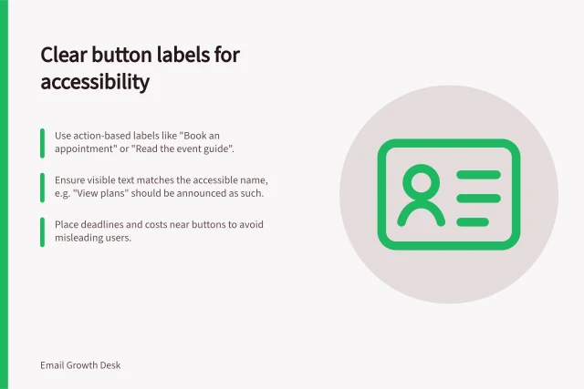
Choosing an accessible button label is covered in the sibling article “Choosing an accessible button label”.
Review several ways of receiving the email
An editor preview is only a starting point. Send a test to representative mobile and desktop email clients, inspect a narrow viewport and zoomed text, then review the message with images off. Read it from top to bottom without using visual position as a clue.
Keyboard navigation and a screen reader can expose a button or link in an unexpected place. Email clients differ, so keep a record of the clients your audience uses and of issues you still need to check.
Use the same core message in the plain-text version if your sending platform supports one. It need not reproduce the visual layout; it should preserve the facts, links’ purposes and action. The final approval question is simple: if the layout broke, would the reader still understand the message and complete the task? If not, fix the content order or text before polishing the template.
In this guide
- Building a mobile email layout with a clear reading orderBuild a mobile email layout that reads clearly in one column, preserves source order and keeps actions beside their explanation.
- Writing image alt text for an emailChoose useful email image alt text by deciding whether each image informs, decorates or acts as a link.
- Testing a campaign with images switched offTest an email campaign with images off so offers, deadlines, conditions and actions remain understandable.
- Choosing an accessible button labelWrite email button labels that describe the destination, match accessible names and make each action clear out of context.